DLR Group + Smith System
Discovering Joy
Classroom A 120: DLR Group + Smith System | Discovering Joy
Goal:
Joy in learning spaces isn’t a byproduct of bright colors or playful shapes, it’s creating a balance that helps students feel calm, focused, and connected. Overly intense colors can overwhelm, raising stress and making it harder to concentrate. Thoughtful use of color turns physical space into a learning tool.
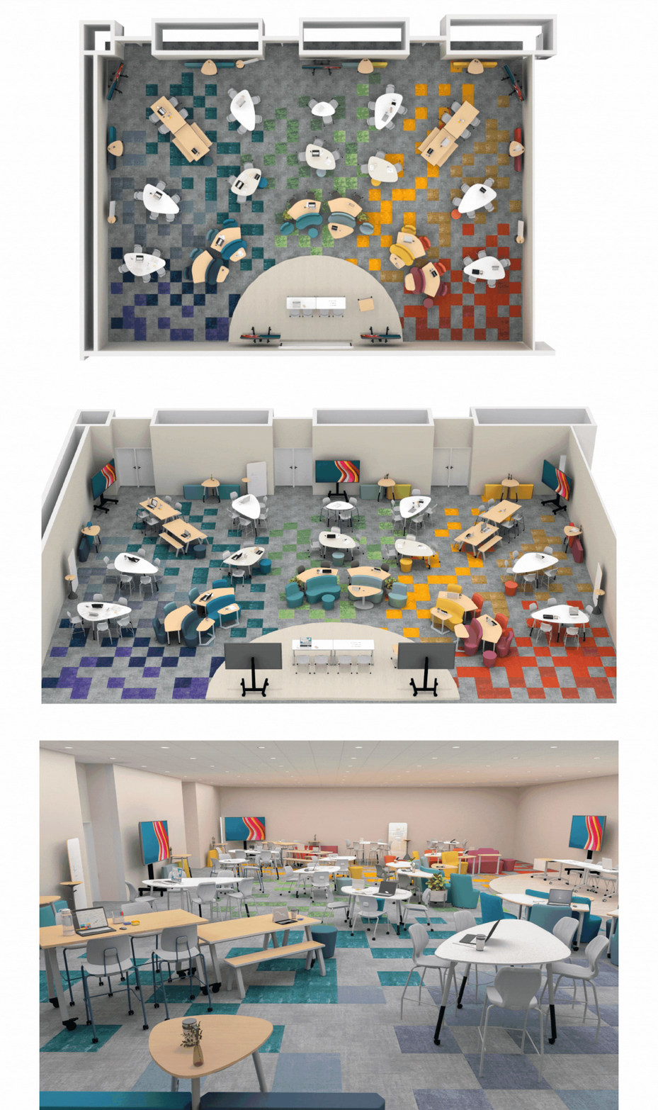
- Cool blues and violets foster quiet focus and restoration.
- Soft greens support comfort and balance.
- Warm yellows bring energy but need moderation.
- Reds spark excitement and engagement.
For educators, this translates to more than aesthetics. Color can:
- Help students self-regulate (“I need a calming spot”).
- Encourage empathy and collaboration (“let’s move where it’s easier to focus”).
- Give students ownership of their environment, building confidence and agency in learning.
In this way, color becomes part of the learning infrastructure by guiding behavior, supporting emotional safety, and shaping joyful, co-created learning rhythms. When people share experiences together, their feelings of joy become stronger. In schools or community spaces, furniture and interior environments can support this by encouraging people to gather. These design choices amplify
Focus:
The “Discovering Joy” Classroom is designed to celebrate connection and community. Scaled with intention, the room features tiered furnishings so that every seat truly feels like the best seat in the house, offering clear sightlines to presenters, visual displays, and peers alike. Flexible groupings foster meaningful dialogue among attendees while also enabling presenters to move seamlessly through the space, strengthening personal connections with their audience. Multiple digital monitors ensure content is always accessible, no matter where participants are located. The material palette blends warm wood tones and light neutrals with biophilic -inspired forms, grounding the space in a sense of calm and natural connection. These organic shapes set the stage for immersive sensory experiences, where flooring and lighting introduce subtle cues of color. Within the room, color “zones” invite attendees to gravitate toward the environments that best align with their needs whether for focus, reflection, or energized collaboration. The result is a learning environment where design not only supports function, but also nurtures joy, belonging, and emotional well-being.
Impact:
What if color became more than a backdrop…what if it became a form of emotional intelligence within our classrooms? In joyful learning environments, color is not just visual; it is instructional. By treating color as a language of emotional literacy, we give students tools to recognize, regulate, and even co-create their own learning conditions. They begin to understand that blue invites calm, green restores balance, yellow activates energy, and red sparks excitement. In doing so, students gain agency by choosing environments that fit their needs and supporting the needs of others. For educators and designers alike, this shifts color from decoration to a framework for well -being, collaboration, and growth by embedding emotional intelligence into the very fabric of learning space design.
Partners:
-
DLR Group
-
Smith System
-
Steelcase
-
Patcraft
-
ClearTouch
-
Pro AV Systems
-
Insight Lighting
